
Plum and June Photography Challenge: White Balance
They say natural light is best when taking photographs and I couldn't agree more with that mantra. When you look at something in real life, you experience the true colors. Taking pictures of fabrics and especially quilts, capturing those true colors are essential. By simply changing the white balance in your camera's settings, you can ensure that the colors you see in person are the same colors that your audience sees. This is very important to any sort of blogger that uses pictures as a tool to share. To be honest, my favorite part to any blog or quilt book are the pictures. And you don't need to be a pro photographer, you can take spectacular pictures with your phone (I do it all the time)!
So this month's challenge at Plum and June is to play with the white balance (WB) in your camera, be it a DLSR, point and shoot, or phone.

I decided to take my pictures inside because that is where I generally have the hardest time getting the colors just right. I turned off every light in the room and opened up the windows. I prefer to take my pictures in raw and not worry about the colors until I am editing on my computer. This challenge I will not edit any of the pictures and they will all be SOOC (straight out of the camera).
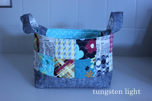
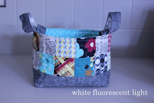
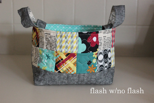
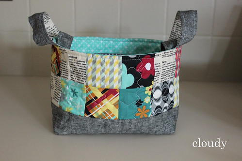
Check your camera manual, but changing the WB can be pretty straight forward. You WILL have to venture out of Auto mode and get in one of the Manual modes. Don't worry, it's not too scary. The WB setting gives you several options depending on your environment: sunlight, shade, cloudy, tungsten light, white fluorescent light, flash, auto, and custom. Custom is where you set your white balance manually. So basically, take the same exact picture and just change the setting each time. For the custom setting, check out this tutorial here at Kitchen Table Quilting if you need help with that! Thanks so much Erica for this tutorial!
Here is what I got:
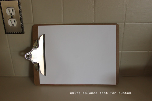 I took this picture first and then went to Menu and set the WB based on the white in this picture.

Conclusion:
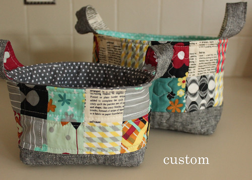
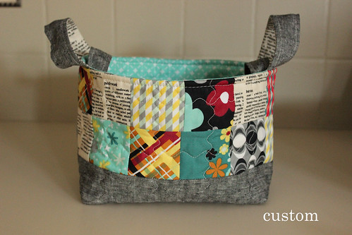
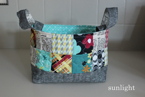
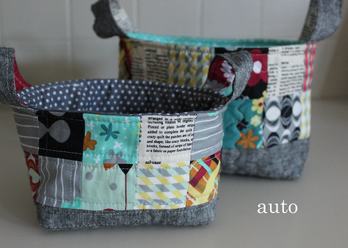
The custom really shows the true colors of the fabrics and pretty much looks exactly how I see it from my eyes. The auto looks good too, but feels a bit on the cool side and the custom feels a bit warmer. But, if you look at the white areas, those look really white.
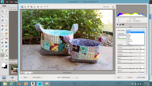
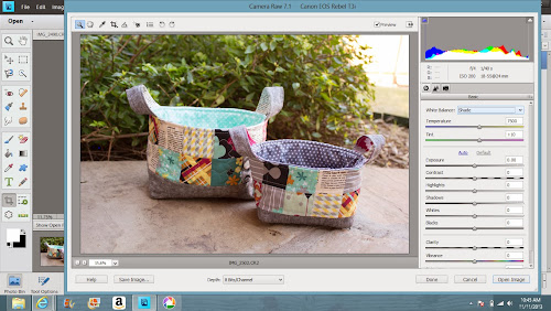
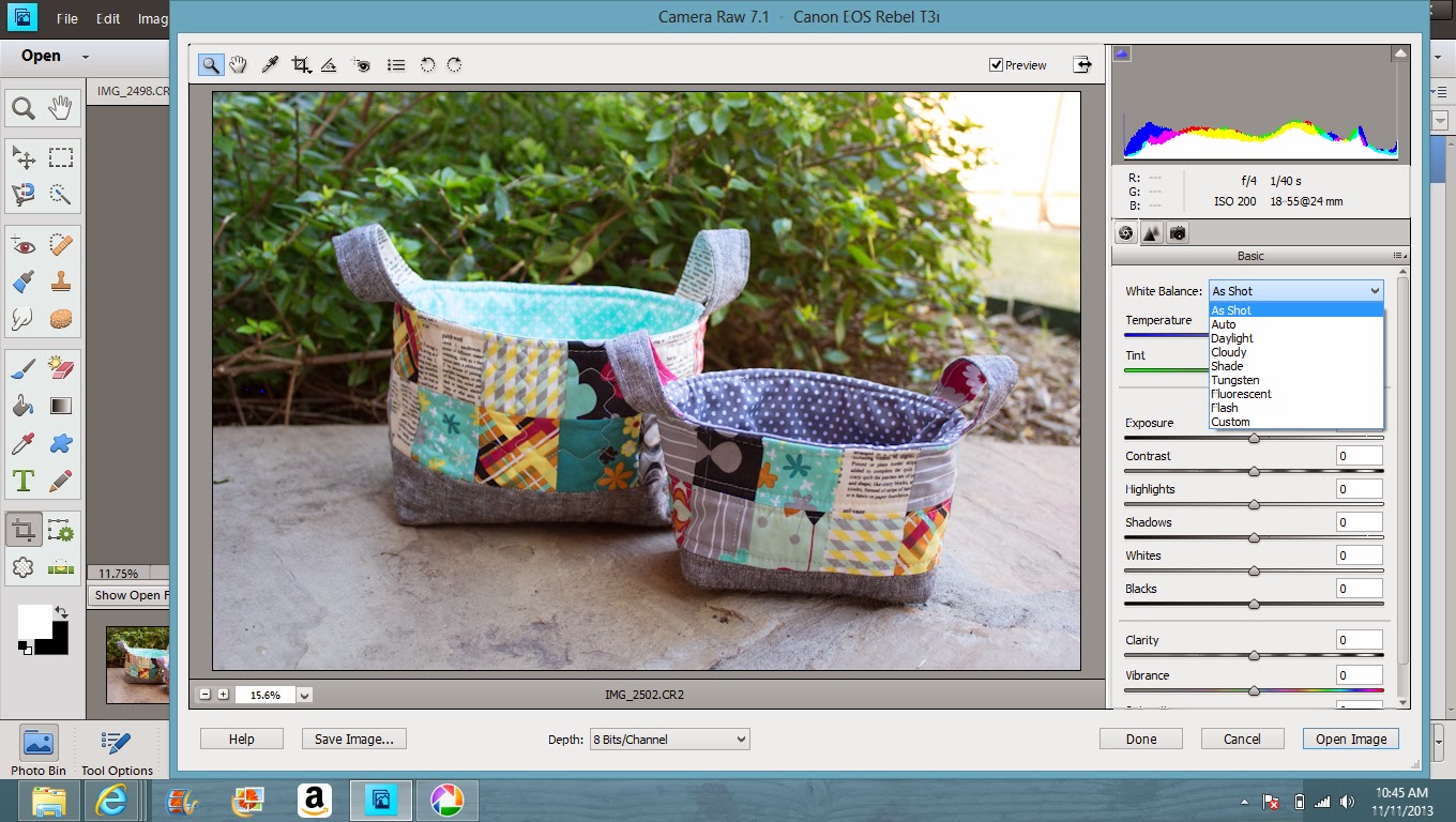
You can do the same thing from the computer after the fact. I use Photoshop Elements and upload my RAW files. I get this screen to do my preliminary edits and one of the first things I do is check to see where I want the WB to be.
I took these pictures outside on my patio in the SHADE. I clicked on shade and auto to see what I got and they were the same thing. I was happy with that and then opened my file to do additional edits and add my watermark.
Hope all that mumbo jumbo made sense! Please tell me what setting you prefer?
Have a great Monday and I'll be blogging about these cute little baskets tomorrow!
Melissa
So this month's challenge at Plum and June is to play with the white balance (WB) in your camera, be it a DLSR, point and shoot, or phone.
I decided to take my pictures inside because that is where I generally have the hardest time getting the colors just right. I turned off every light in the room and opened up the windows. I prefer to take my pictures in raw and not worry about the colors until I am editing on my computer. This challenge I will not edit any of the pictures and they will all be SOOC (straight out of the camera).
Check your camera manual, but changing the WB can be pretty straight forward. You WILL have to venture out of Auto mode and get in one of the Manual modes. Don't worry, it's not too scary. The WB setting gives you several options depending on your environment: sunlight, shade, cloudy, tungsten light, white fluorescent light, flash, auto, and custom. Custom is where you set your white balance manually. So basically, take the same exact picture and just change the setting each time. For the custom setting, check out this tutorial here at Kitchen Table Quilting if you need help with that! Thanks so much Erica for this tutorial!
Here is what I got:
I took this picture first and then went to Menu and set the WB based on the white in this picture.Conclusion:
The custom really shows the true colors of the fabrics and pretty much looks exactly how I see it from my eyes. The auto looks good too, but feels a bit on the cool side and the custom feels a bit warmer. But, if you look at the white areas, those look really white.
You can do the same thing from the computer after the fact. I use Photoshop Elements and upload my RAW files. I get this screen to do my preliminary edits and one of the first things I do is check to see where I want the WB to be.
I took these pictures outside on my patio in the SHADE. I clicked on shade and auto to see what I got and they were the same thing. I was happy with that and then opened my file to do additional edits and add my watermark.

Hope all that mumbo jumbo made sense! Please tell me what setting you prefer?
Have a great Monday and I'll be blogging about these cute little baskets tomorrow!
Melissa


This is so informative, I always gave problems photographing indoors. Thanks for the rundown!
ReplyDeleteYou are so welcome, Jenn! Thanks for stopping by!
DeleteThat really is such a difference between the custom and auto. I think I like the custom better because of the warmer colors. Thanks for participating!
ReplyDeleteHi Beth! Yeah, I like the warm colors as well. It seems more true. Thanks for hosting and look forward to the next one!
Delete